Living room curtains need to belong beside the sofa as well as around the glass. White sheers can connect a broad window wall, a repeated color can unite different window shapes, and patterned panels can pick up a cushion or rug. These living room curtain ideas show those choices in furnished rooms, so you can compare the whole arrangement before choosing fabric.
Start with the part of the room you want to keep: a green couch, pale walls, a patterned chair or the view outside. The curtains don’t have to match that feature; they can support it or become the main pattern themselves. Below, the examples move from barely visible window layers to stronger colors and prints.
Let Sheer Curtains Connect a Wide Window Wall
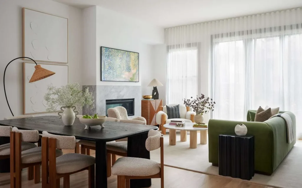
White sheers stretch behind the green sofa in this living and dining space, giving the broad window wall a continuous pale surface. The window divisions remain visible through the fabric. In front, the dark dining table, curved sofa and small black side table have clear outlines against that quiet background.
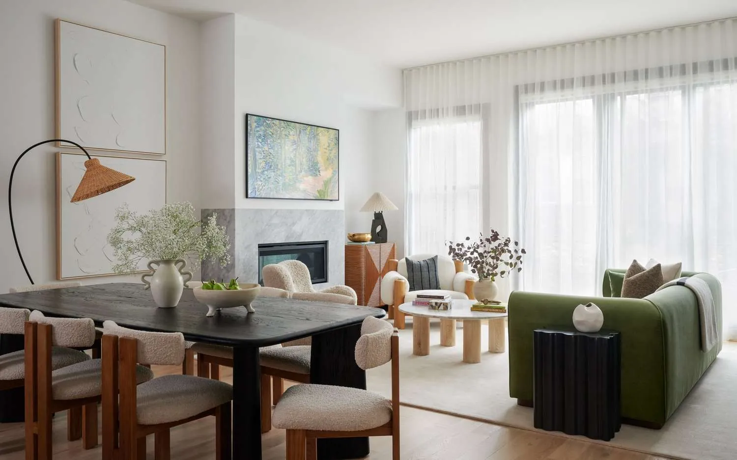
We’d choose this direction when the seating already has a strong shape or color. The eye can follow the windows without meeting another large motif, while the furniture keeps its own character. In an open living and dining room, that unbroken window treatment also gives the different seating groups a shared backdrop.
Sheers aren’t limited to plain white. Wide beige bands cross the white curtains beside this rust-colored throw and wood-framed seat. Those bands don’t hide the window grid, and the beige repeats some of the warmth of the nearby brown and orange textiles.
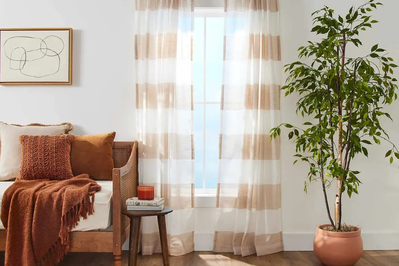
Choose the striped version if a plain white window feels disconnected from warm seating. With a busy rug or several patterned pillows, the uninterrupted white version gives those pieces more room. Our neutral living room palettes offer more comparisons of cream, sand and gray beside existing furniture.
Repeat Curtain Color Across Different Window Shapes
Once you’ve chosen a quiet or patterned background, consider whether the windows need the same treatment. Pale pink connects the long curtain and smaller folded shade in this room, even though they cover different window shapes. The pink tray and small accessories carry that color toward the center of the seating area.
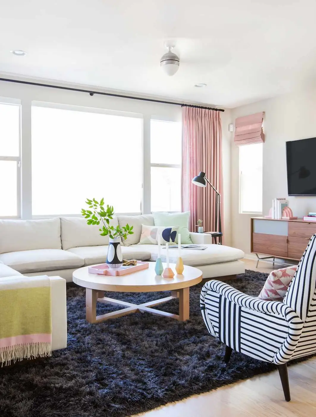
The useful idea is the shared color, especially if one window sits beside a cabinet and another runs behind a sofa. A short shade can belong with a long curtain without both windows having identical outlines. We’d keep the fabric’s color close and let the folds supply the difference, as they do here.
A bay window presents a different shape to work with. Pale patterned panels sit between the window sections around four cream armchairs. The fabric follows the changes in the wall, leaving the panes visible above the seating and keeping the curved arrangement easy to read.
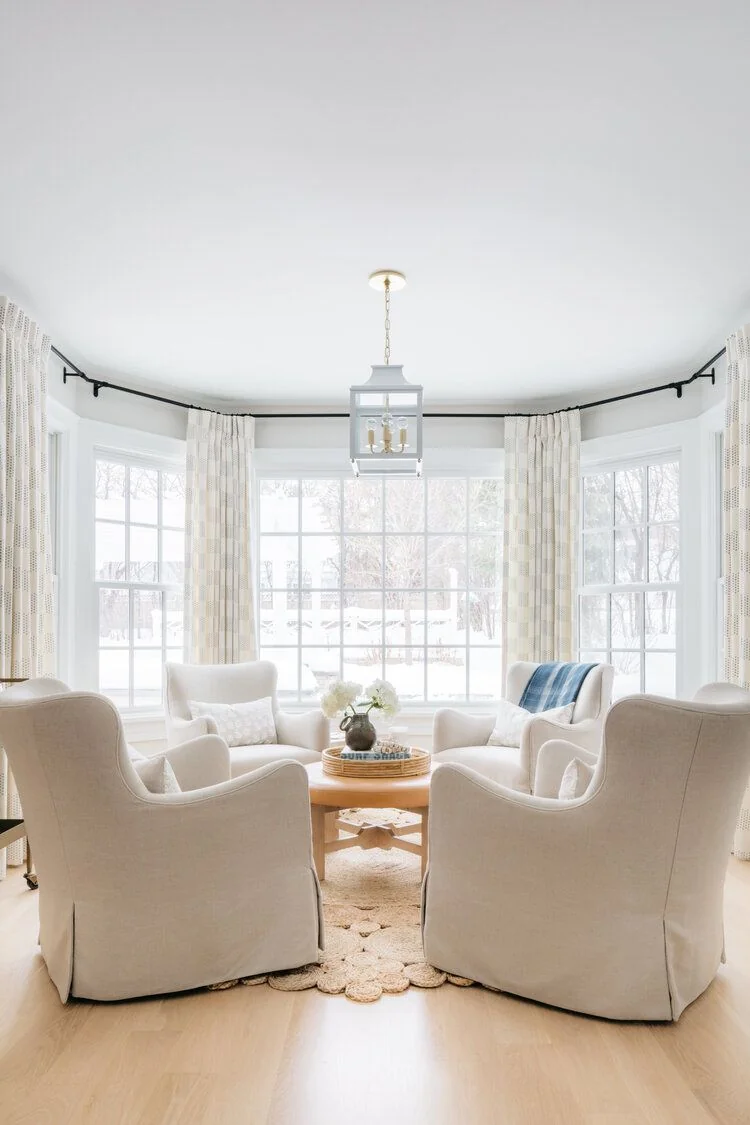
For a bay seating area, compare the curtain pattern with the chair backs as well as the window trim. Here, the fine marks give the pale fabric detail without introducing another strong color. A bolder print would make the window sections more conspicuous; the quieter panels let the gathered chairs remain the center of the scene.
Make Curtain Layers Visibly Different
Matching color can connect separate windows; within one window, a little difference helps distinguish the layers. Pale checked outer curtains sit beside white sheers and a green sofa here. The check is soft enough to stay in the background, but its warmer squares remain visible against the white inner fabric.
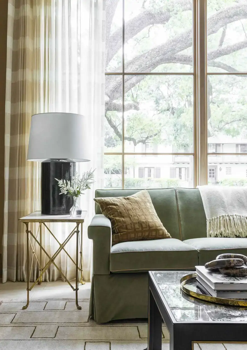
Look at the curtains together with the nearest pillow. The brown patterned cushion shares some warmth with the outer panels, while the green upholstery sits between those tones and the bright window. We’d borrow that restrained mix when the sofa already supplies the room’s main color. These green couch combinations compare more wall, rug and pillow choices around green seating.
Olive panels and brown woven-looking shades make a stronger distinction in the next room. The green runs down the sides of the windows, while brown forms a horizontal band above each pane. White chairs and the pale fireplace leave clear breaks between those darker areas.
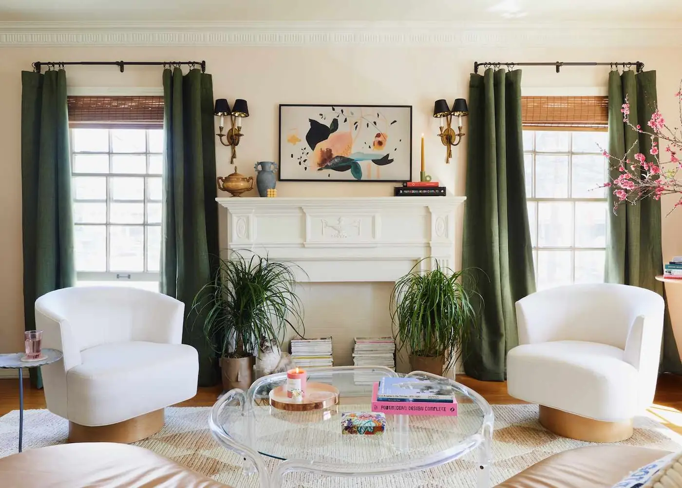
We like this pairing for a room with pale upholstery that needs more color around its edges. Brown can connect the window to an existing wood floor or cabinet, with green supplying a separate accent. Keep a sample of both window fabrics beside the upholstery so you can judge the whole palette; matching either fabric alone won’t show their combined effect.
Give Floral Curtains a Smaller Pattern Nearby
When the layers already feel distinct, pattern offers another way to bring the window into the seating scheme. Large flowers and dark branching stems cover these curtains, while the window-seat cushions use red lines and a smaller red-and-white motif. The curtain print includes warm red-orange notes that connect it to the cushions.
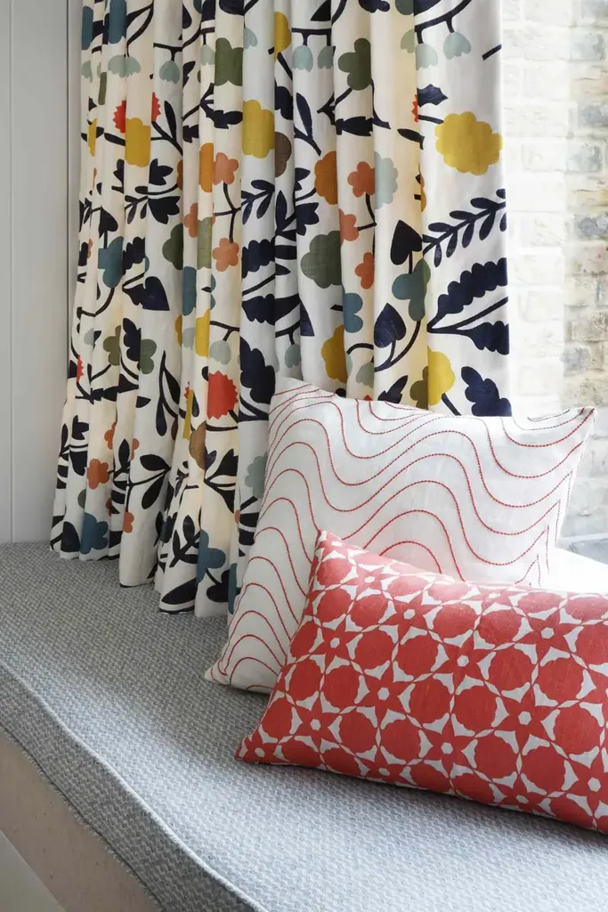
The patterns differ enough to stay legible together: broad flowers behind, fine waves and a denser motif in front. Plain gray seating gives the prints a quieter surface to sit against. For a smaller version, we’d take one color from a floral curtain and repeat it in a cushion you can see from the doorway.
You don’t have to echo every color in a multicolored print. If the couch already has a strong pattern, try a plain cushion first, then compare whether another print adds anything. For the same decision beside bedding, our bedroom curtain pairings show curtains with floral prints and checks; here, the sofa or window seat remains the comparison point.
Carry Blue-Gray Curtains into the Seating Area
If floral fabric would compete with furniture you love, solid blue-gray curtains can carry color more quietly. Here, long panels frame the windows on either side of a fireplace. Related blue-gray notes appear in the artwork, rug and sofa pillows, connecting the window edges to the middle of the room.
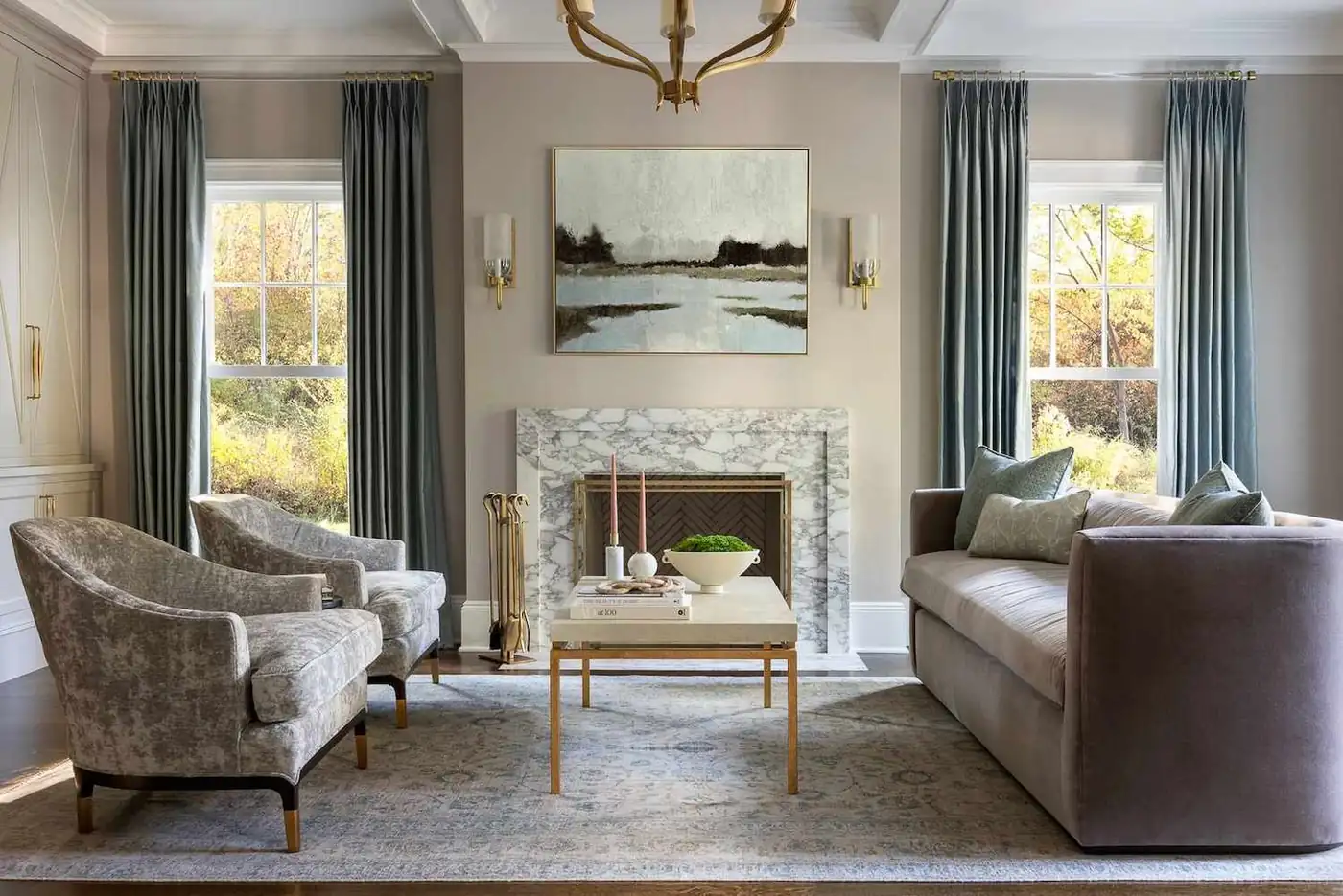
A gray room doesn’t always need another accent color. Here, the curtains are deeper than the wall, so their folds remain distinct beside pale upholstery and a patterned rug. We wouldn’t add a bright curtain to this arrangement; the slightly deeper blue-gray gives the windows definition while staying within the existing palette.
Before settling on fabric, look across the room with a sofa cushion, rug and curtain sample in the same view. Then compare them under the lamps you use after sunset. The cozy living room examples show how repeated accents and separate points of light connect seating areas after dark.
Choose the window relationship you actually need: a continuous pale backdrop, a shared color for unlike windows, or a print that belongs beside the seating. Confirm privacy and light-control details from the product information separately; the photographed arrangement shows the decorative pairing. For more rooms to compare, browse the living room and bedroom ideas on ZM Home.