
A neutral living room gains definition when its pale surfaces have different jobs: cream seating can sit against a deeper sand wall, gray floors can meet a warmer rug, and a patterned table can lead an otherwise quiet room. These eight ideas move through cream, greige and taupe palettes, then show how to choose a change for your existing space.
Look at the largest surface you’re keeping before choosing an accent. The floor, wall and sofa set the color relationships; a pillow is a smaller adjustment within them. Use the rooms below as visual references for those relationships, with paint and fabric samples checked in your own light before committing to a color.
1. Let Cream Living Room Textures Stay Different
Cream upholstery and a cream rug can share a color without looking like one continuous surface. Here, the sofa’s fine weave sits above the rug’s pronounced rows, while the rounded pouf brings a chunky, looped texture closer to eye level. The differences give the pale area detail even where the colors nearly meet.
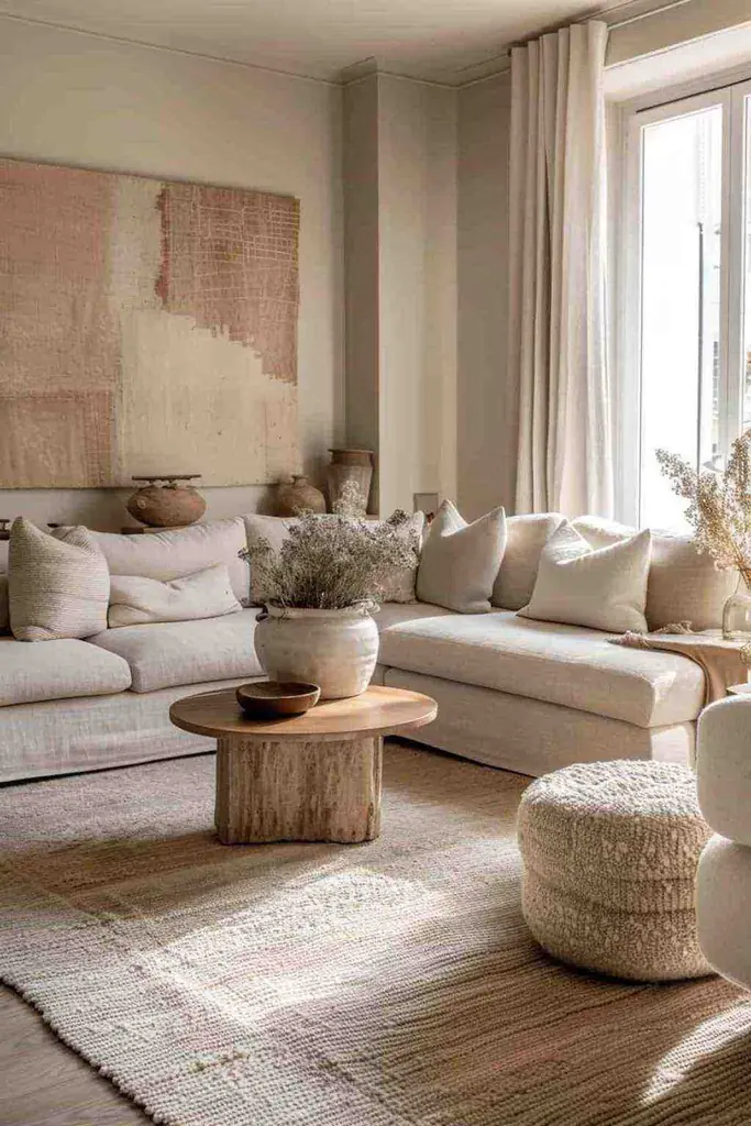
The table adds a different kind of pattern. Its wood grain runs through a solid shape, so the center of the room has a firmer outline than the textiles around it. The broad tan-and-cream artwork carries those colors higher up the wall, away from the floor-level cluster.
If your sofa and rug are already close in color, try a visibly different cushion cover before adding another shade of beige. A coarse weave beside smoother upholstery can make that small change legible. We’d keep the other cushions fairly simple so the new surface has room to show.
2. Set a Cream Sofa Against a Sand-Colored Wall
A deeper sand background offers another way to define cream seating. The wall behind this chaise sofa stays visibly darker than its back cushions, giving the pale upholstery a clear upper edge. The wood cabinet below the artwork continues that deeper band across the room.

The cushions carry the wall-to-sofa contrast into the seating itself. White and cream sit toward the back, with tan and brown in front. Those smaller dark areas help distinguish the cushions without a bright accent color, and the pale throw remains easy to see against the chaise.
For a room with beige walls already in place, compare a cream cushion with the sofa first. If the two blend together, a deeper tan cover may give a clearer result. The aim is a visible change in lightness; matching a photograph’s exact paint color is a separate decision that needs a physical sample.
3. Pair Greige Living Room Walls with Weathered-Looking Wood
Greige, the gray-and-beige middle ground, gives this living room a quieter background than the sand wall above. Cream seating and curtains sit in front of it, while a weathered-looking wood table introduces irregular grain through the center. The table has enough variation to hold attention among the plain fabrics.
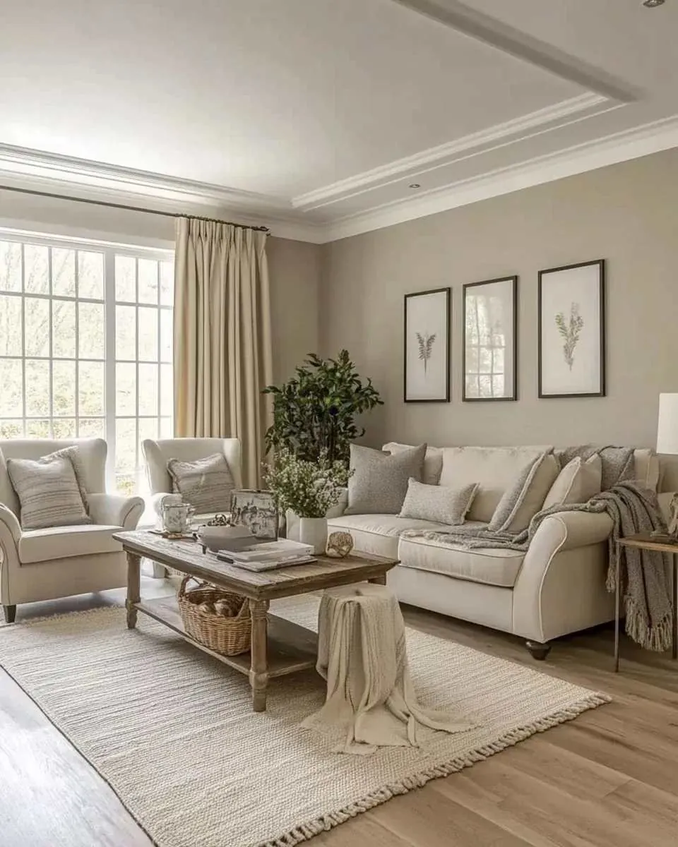
Gray cushions connect the sofa to the wall, and the cream curtains connect it to the window area. Those links matter more here than an exact furniture match. The armchairs have different outlines from the sofa, yet the restrained upholstery colors let the seats read together.
With a gray-beige wall, compare wood tones beside both the wall and upholstery. A table with visible grain can supply the variation that a plain sofa lacks. Keep an existing wood table if its color works with those neighbors; a pale runner would hide some of the very detail this arrangement uses.
4. Keep a Gray Living Room Soft with Cream and Fine Pattern
A cooler-looking gray wall can stay part of a pale room. In this arrangement, the light sofa, cream cushions and white lampshades occupy most of the foreground. The thin curtain rod and gray areas in the artwork provide sharper lines above them, keeping the walls connected to the seating.
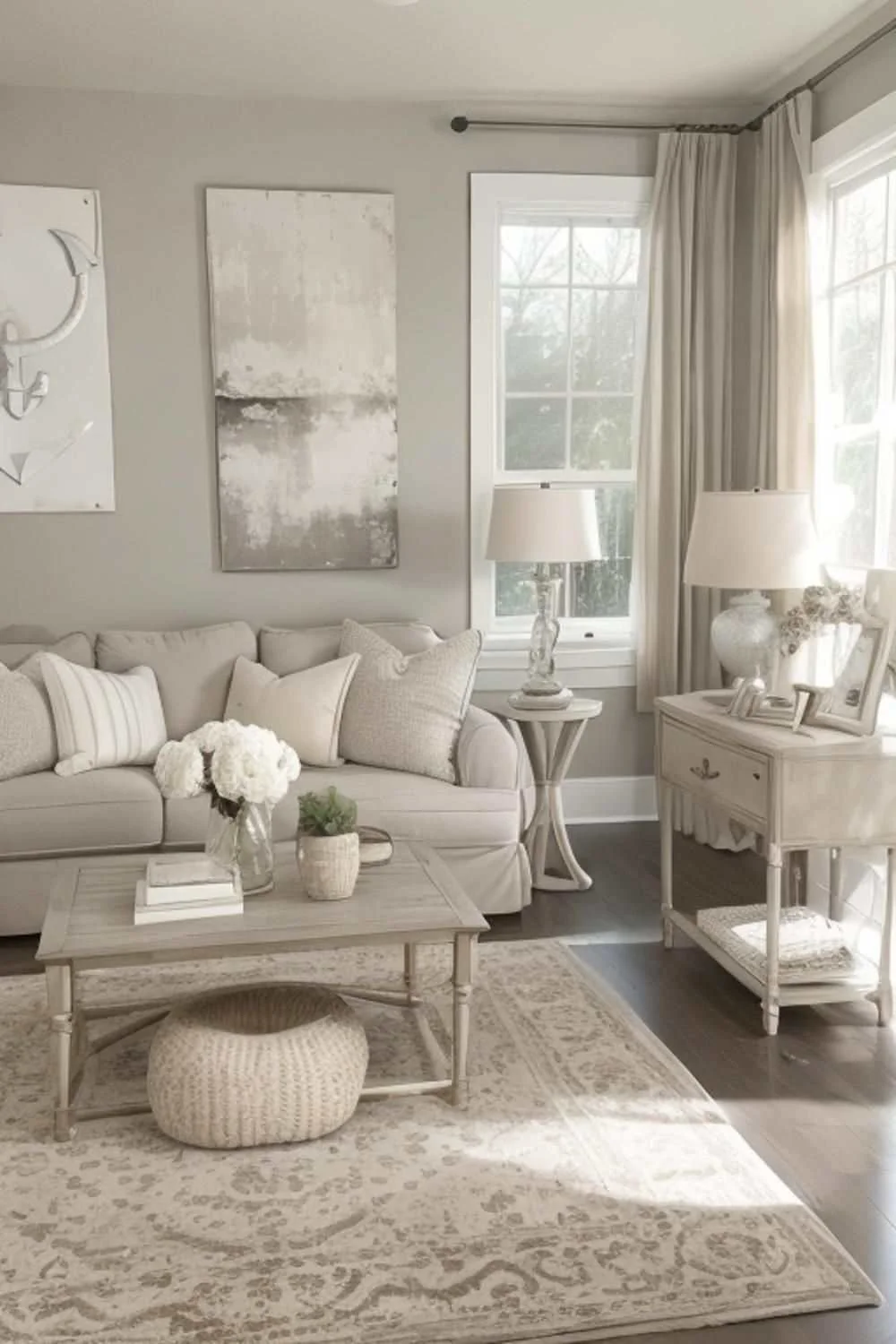
The rug makes the useful connection underfoot: its pale background belongs with the sofa, while its gray pattern picks up the wall. The small knitted pouf adds a raised surface under the coffee table. Neither detail needs a strong new color to be noticeable.
Try a cream cushion against an existing gray sofa and look at the pair from across the room. If the cream seems isolated, repeat a little of that color in the rug or lampshade. A pattern containing both shades can provide the link while letting the gray furniture remain the larger presence.
5. Use White Trim to Define Taupe Living Room Walls
Taupe takes the gray-and-brown relationship deeper, and white trim makes the difference easy to see. The window frames and ceiling molding form bright edges around this room’s walls. The upholstery sits between those whites and the darker wall, giving the seating its own place in the palette.

Pale patterns on the cushions add small changes within that middle layer. The large coffee table stays close to the seating in color, though its grain and curved outline distinguish it. Keeping the table relatively light lets the wall carry more of the room’s depth.
White trim can be a useful comparison point when considering a taupe paint sample. Hold the sample beside the trim and sofa fabric together. For a gentler wall-to-sofa transition, try a lighter sample; for more definition, compare a deeper one while leaving the upholstery unchanged.
6. Bridge Gray Living Room Floors with a Warm Pale Rug
When gray is on the floor, a pale rug can change the color directly beneath the seating. This room leaves a broad border of gray, wood-look flooring exposed, with a warmer-looking rug in the middle. The sofa and armchairs then meet that lighter area rather than the gray boards alone.
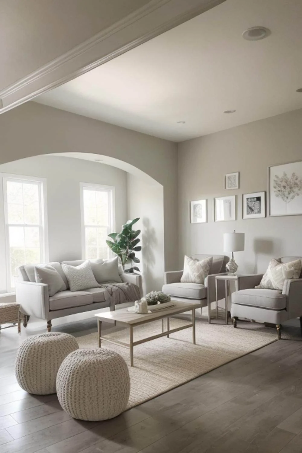
The coffee table’s open frame leaves much of the rug visible. Its pale wood tone also falls between the cooler floor and cream textiles. In front, the knitted poufs repeat the rug’s light color with a more pronounced surface, giving the foreground detail without another large pattern.
For gray floors you’re keeping, lay a rug sample beside a sofa cushion before choosing the whole rug. Look for a pale shade that sits comfortably with both. We’d favor a quieter rug when the floor already has conspicuous grain; the larger light area can do the work without extra motifs.
7. Give a White Living Room Some Tan and Wood Grain
White seating creates a brighter starting point than the gray-floor scheme. Tan cushions interrupt this sectional’s broad white surface, while a wood coffee table brings a deeper tone into the foreground. The contrast stays gentle because the cushions and table share a warm brown direction.
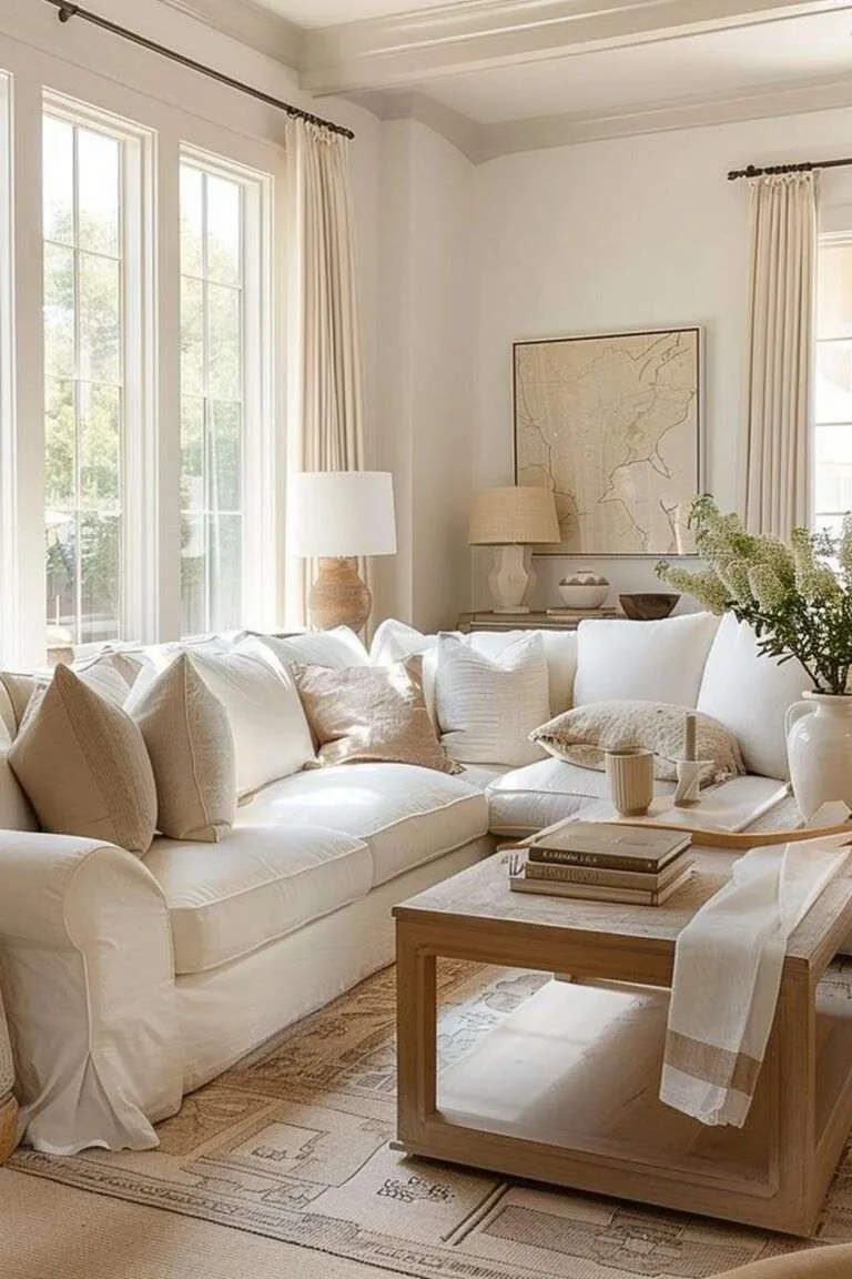
Small brown details carry that relationship beyond the sofa. A dark bowl sits farther back, and the artwork has a fine dark frame around a mostly pale image. Those thin edges add definition higher in the room, where another large brown object might feel heavier.
A tan cushion is a useful trial if a white sofa feels disconnected from an existing wood table. Compare the cushion and table in the same view, then adjust the cushion’s depth or warmth. The brown shades can differ; a clear visual connection is more useful than trying to match fabric to wood exactly.
8. Let Veined Stone Lead a Neutral Living Room
A bold stone pattern can supply the variation that the earlier rooms get from wood grain. Dark branching veins make this coffee table the strongest pattern beside the cream sectional. The taupe wall leaves a plain background behind the seating, giving the tabletop plenty of attention.
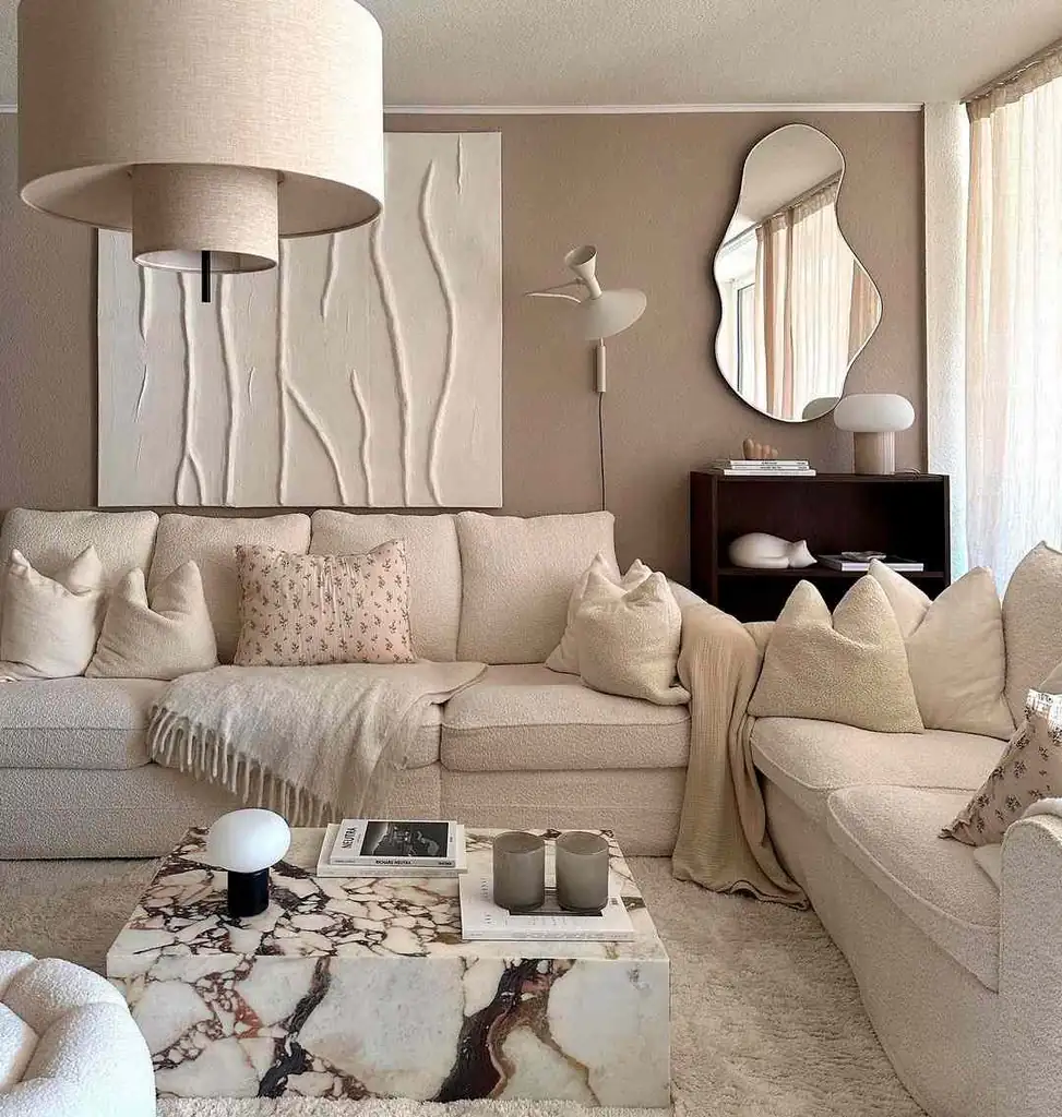
The floral cushions introduce a smaller scale of pattern. Their pale backgrounds stay close to the sofa, so the flowers register as fine detail beside the larger stone markings. The wall art has raised lines, adding another surface while keeping its color near the upholstery.
With a strongly patterned table, try plain cushions first and add a fine print only if the seating needs it. We’d keep large tabletop objects simple enough to leave the veining visible. The contrast comes from the pattern’s scale and darkness; the picture alone doesn’t establish the table’s material or finish.
Which Neutral Living Room Detail Should You Change?
Choose the adjustment that addresses the color relationship already causing trouble. A room where pale furniture disappears into the wall needs a different change from one where a gray floor feels disconnected. The table below gives a starting point for comparing pieces you have, before replacing a large surface.
| What you notice | A change to compare | What to look for |
|---|---|---|
| Cream cushions disappear into the sofa | A more pronounced weave | A surface you can distinguish while the color stays close |
| A pale sofa blends into beige walls | A deeper tan cushion | A clear edge within the seating that repeats the wall’s warmth |
| Gray flooring feels separate from cream furniture | A warmer pale rug sample | A middle shade that works beside both the floor and upholstery |
| White seating feels detached from a wood table | A tan cushion | A brown connection across the seating area |
| Several patterns compete with a veined table | Plain cushions and simpler tabletop objects | More space around the table’s strongest markings |
Bring the samples to the spot where they’ll sit and check them in daylight and with your usual evening lamps. Keep the largest existing surface in view while comparing. A cream that works beside the sofa still has to work beside the floor, and that final comparison can change which sample you choose.
For the lamps around those samples, compare living room light placement beside the sofa, reading chair and background wall.
For smaller rooms, compare light-looking living room furniture and decor through open chair frames, low sofa backs, and simple textiles.
For a stronger sofa color within a pale room, compare these green couch palettes, and use the narrow living room layouts when arranging the furniture.