
By ZM Home Editorial Team
Cream walls, a beige headboard, and white bedding can make a quiet bedroom, but the pale pieces still need some separation. A deeper throw, a raised weave, or a curved bed frame gives the eye something to follow without adding a strong color. These eight neutral bedroom ideas show how to choose between soft layers, dark contrast, checked bedding, and a simpler white bed.
Start with the largest piece you’re keeping. If it’s a dark bed, white sheets can make that outline part of the scheme; if the bed and walls are both pale, a deeper cover or a textured pillow can separate them. That choice also helps narrow the smaller accents. A brown pillow or black lamp may be enough when the bedding around it stays simple.
1. Keep Cream and Beige Bedroom Layers Distinct
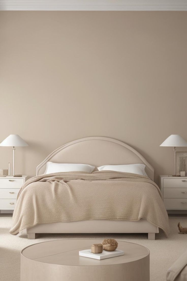
The curved headboard gives this cream-and-beige palette a distinct edge. Its double outline separates the bed from the pale wall, while the textured tan cover adds a slightly deeper band across the mattress. White pillows leave a bright sliver between the two.
This image may be a rendering or generated scene; treat it as a palette illustration. The useful relationship is easy to try with existing bedding: spread a textured beige cover over white sheets and leave some white visible at the top.
With a straight headboard, let the blanket supply more of the variation. A pronounced weave can carry the bed’s detail while the wall stays plain. You don’t need to copy the curved furniture to borrow this pale color combination.
2. Balance a Charcoal Headboard in a Pale Bedroom
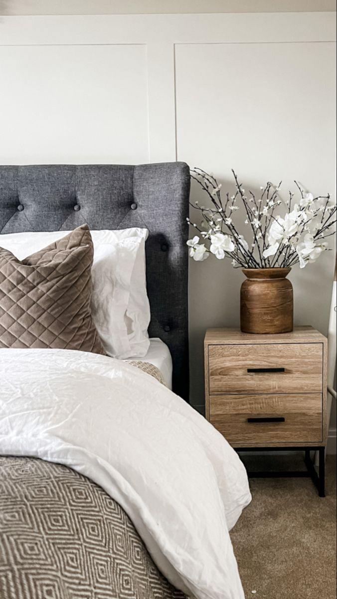
A charcoal headboard creates a much firmer outline around white bedding. Here, the dark upholstery makes the white pillows easy to distinguish from the pale wall. A brown quilted pillow and geometric bed-end throw bring smaller patterns into that clear light-and-dark arrangement.
The bedside cabinet and brown vase pick up the pillow’s warm tone, carrying brown from the bed to its side. The pillow’s stitched diamonds also echo the throw’s angular pattern, linking the textiles even though their surfaces look different. That gives the bed a connection beyond simply matching colors.
Keep a dark headboard you’ve already got and try white bedding against it first. Add a brown pillow if the contrast feels too stark. For a gentler result, replace the graphic throw with a solid one while keeping that brown accent.
3. Mix Textile Surfaces in a Taupe Bedroom
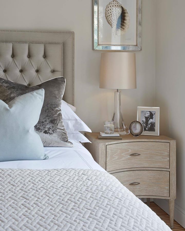
Taupe can also sit between a pale bed and darker pillows. The buttoned headboard here has a relatively even surface, the gray pillow has a mottled sheen, and the pale coverlet has a raised geometric texture. Each reads differently despite the restrained colors.
A light blue pillow introduces a small departure from the gray-and-taupe scheme. Keep that option if an entirely neutral bed feels too subdued. The blue stands out because the surrounding pillows and coverlet leave it room, and the clear lamp base keeps the bedside arrangement light.
Try changing a pillow cover before replacing the whole bedding set. A plush-looking surface beside a visibly stitched coverlet offers contrast within the same family; a smooth pale pillow gives a quieter finish if sheen feels too dressy.
4. Use One Small Black Accent in a Pale Bedroom
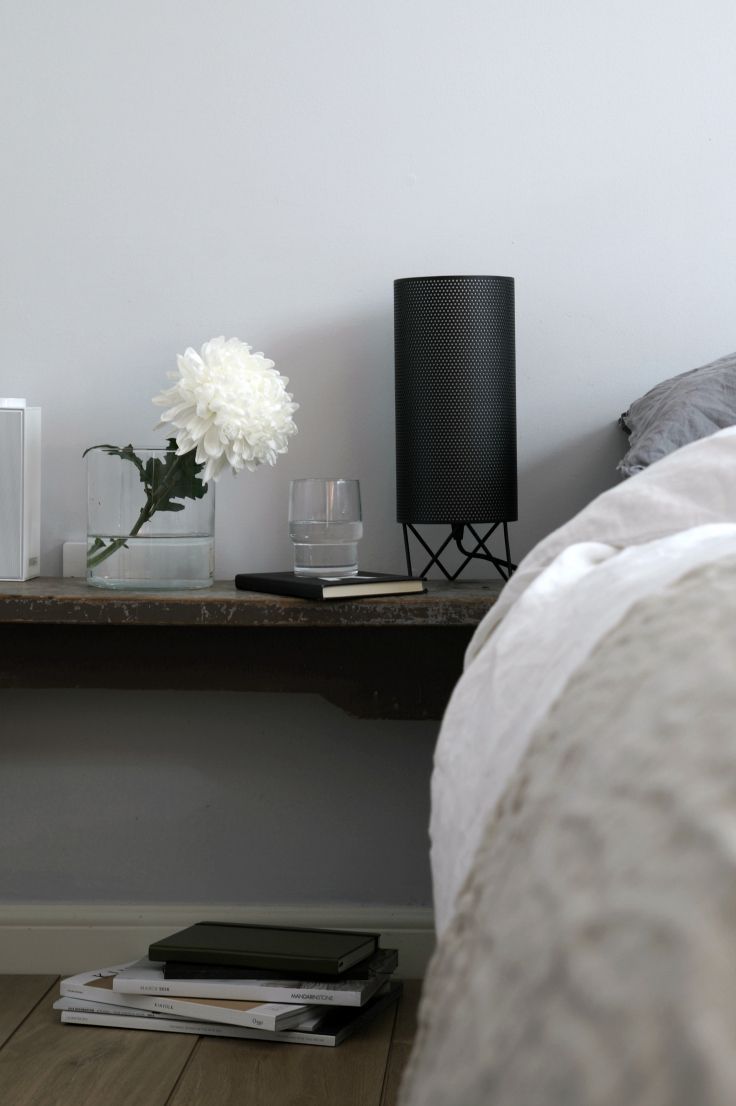
A bedside lamp offers a smaller way to bring in dark contrast. The black cylinder in this arrangement stands clearly against a pale wall, above a dark shelf and beside soft gray-and-white bedding. White flowers and clear glass keep the neighboring objects visually light.
Keeping the dark area at the bedside suits a room whose pale bedding already feels right. The lamp gives that corner an outline, so the bed doesn’t need a dark headboard to create contrast.
Try a black lamp with the bedding you have, then look at the whole corner before adding more black accessories. If that much black feels too prominent, a pale shade over a dark base leaves a smaller dark outline.
5. Soften White with a Pale Gray Headboard
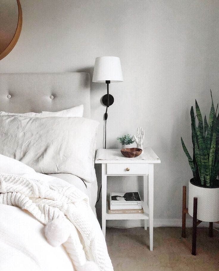
Pale gray gives white bedding a softer backdrop than charcoal. In this arrangement, the upholstered headboard is just deep enough to show behind the pillows, while the white nightstand continues the bed’s light color beside it. The black wall-light stem supplies a thin, sharper line.
The bed itself has plenty of variation: rumpled pillow covers, a loosely draped blanket, and a more even headboard surface. Keep those differences visible if several pieces share nearly the same shade. A tightly matched set would create a more uniform impression.
Choose a gray pillow or throw as a small first change if the bed already has a white frame. The tall plant is an optional green accent; the pale-gray-and-white combination still gives the bedding its structure without it.
6. Bring Pattern into a Neutral Bed
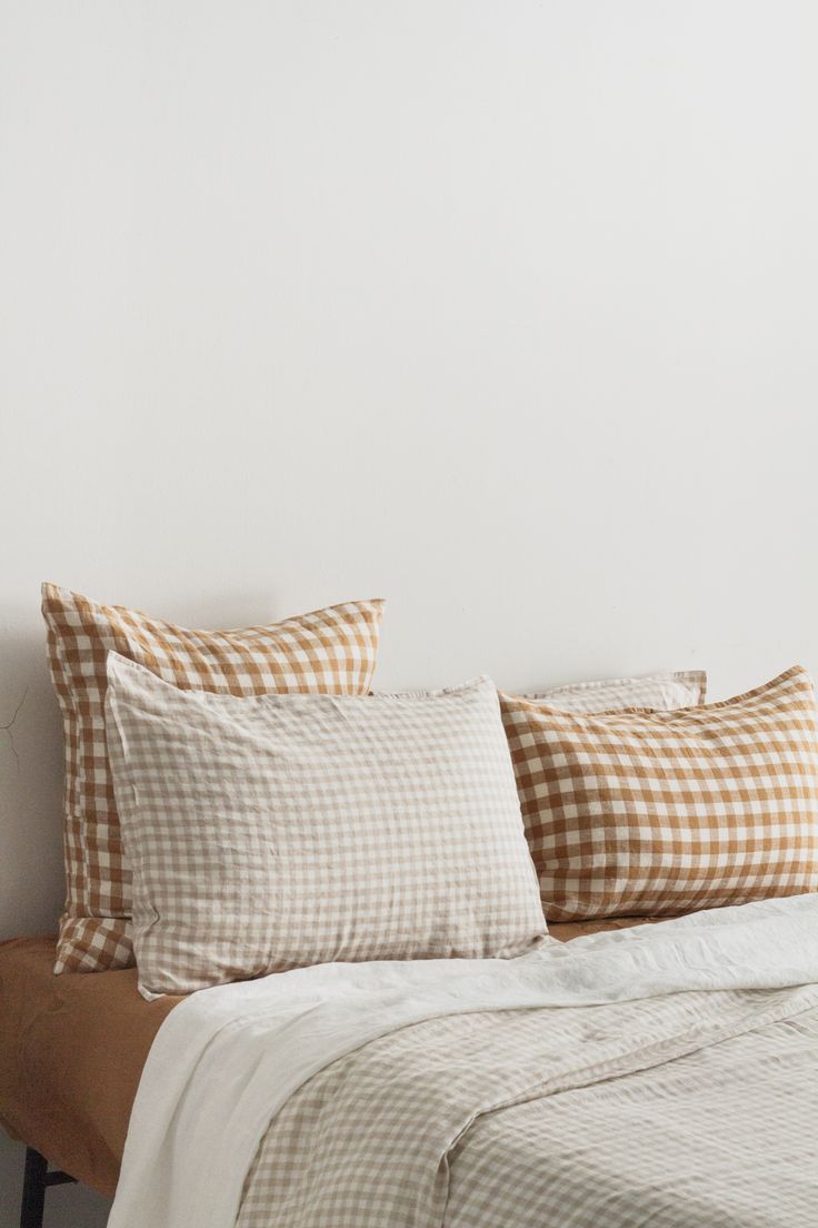
Checks give a neutral bed a more playful direction. Caramel-and-white gingham pillows sit behind a paler, smaller check here, and the subtle checked bed cover extends the pattern across the mattress. The plain wall gives the repeated squares a quiet background.
Notice both the scale and the color difference. The larger caramel checks stay legible behind the small pale ones, so the pillows remain distinct. Matching every check’s size and contrast would give the bed a busier, more uniform grid.
Begin with one caramel checked pillow against a solid cream duvet. If you enjoy the pattern, bring in a smaller check next. For an existing patterned wall, keep more of the bed solid and let a single gingham pillow make the connection.
7. Repeat Natural Texture in Art and the Headboard
The curved, woven-look headboard links this bed to the pictures above it. Several prints show curved forms and close views of textured surfaces, while sand-colored pillows echo their tan and cream areas. Thin stripes across the gray bed cover add a separate, quieter rhythm.
White frames keep each picture distinct against the warm gray wall. With several images grouped together, repeating that frame color gives their different subjects a common boundary.
Use artwork you already own to find a bedding accent: a tan shape might suggest a pillow, or a gray shoreline might suggest a striped cover. If a full gallery feels crowded, one textured image can make the same connection with the headboard.

8. Leave Some Layers Out
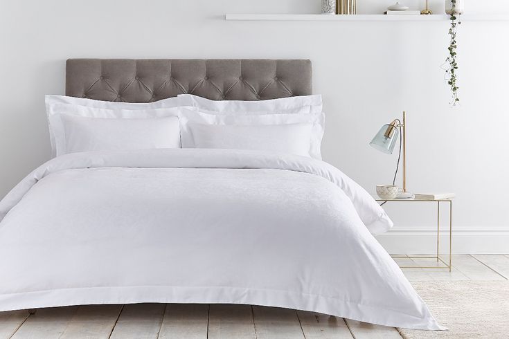
A broad expanse of white bedding can be the finished look. The taupe buttoned headboard supplies depth here, and the slim gold-toned table and lamp add fine outlines beside the bed. The duvet’s uninterrupted surface lets those details show.
If decorative pillows usually end up on the floor, skip them. Keep the sleeping pillows neatly arranged and let the headboard carry the detail; a bed-end throw remains an option when you’d like a little more color. A woven headboard with pale bedding offers another direction when you want the bed itself to carry more shape.
Choose the example closest to your bed, then change the part that’s doing the least: a cover that disappears into the headboard, a pillow that needs texture, or an overfilled bed that could lose a layer. Keep the wall color and bedside furniture in the scheme. If paint is on the list, compare physical samples beside the bedding before choosing a shade.
To carry the bedroom palette beyond the bed, compare these bedroom curtain combinations, and use the guest bedroom arrangements when the room also welcomes visitors.